Almost daily, left-wing organizations – Citizens for Tax Justice and the Center on Budget and Policy Priorities are two of the most prominent – have been publishing attacks on the House and Senate tax bills. Their analyses are often recycled in White House and Treasury Department statements and repeated by liberal reporters. The gist of the attacks can be summarized briefly: the tax cuts are nothing but give-aways to the rich.
To support this charge, the left-wing organizations and the Clinton Treasury Department use distribution tables that allegedly show how the tax bills will affect people or households with different incomes. In theory, a person who makes, say, $40,000 per year should be able to look at one of these tables, find the line for $40,000 and discover how much more or less tax the person will pay if the legislation becomes law. However, in reality the tables are very unlikely to tell how tax liabilities will really change.
Averages Don't Reflect Reality
The distribution tables are necessarily averages of all people with the same income. But we all know from experience that our own tax liability can often differ greatly from neighbors or coworkers with the same income. That is because some people are more aggressive or more adept at taking advantage of provisions of the tax code that can lower one's tax liability. For example, many, perhaps most, workers eligible to contribute to 401(k) plans or Individual Retirement Accounts fail to contribute to these accounts or contribute less than the maximum. The result is that they pay more taxes than they have to.
There are also other reasons why tax liabilities may differ, including family size, filing status, the nature of one's income, one's age and a host of other factors. But even ignoring these problems, it will still be difficult to determine a tax bill's impact on one's own tax liability because the distribution tables always present income ranges rather than specific income levels. One common range often used is the quintile, representing 20 percent of families or households.
Quintiles can represent very wide variations in income. In the latest table from Citizens for Tax Justice, for example, the fourth quintile is defined as those with incomes be-tween $62,200 and $124,000. Those in this group are estimated to get a $1,513 tax cut from the House bill – quite a lot for somebody with a $62,200 income, not so much for somebody with a $124,000 income. Yet they are all lumped together, making it almost impossible for anyone whose income actually falls into the fourth quintile to tell what, if any, tax cut they are actually getting.
By way of illustration, during discussion of the 1997 tax bill the Treasury Department issued a distribution table showing that someone with my income would get an average tax cut of just over $13,000 per year. In fact, I got no tax cut whatsoever. My tax liability in 1998 was exactly what it would have been under 1997 tax law. Anecdotal evidence suggests that a great many people had the same experience because they didn't have children, taxable capital gains, sell their house or die and leave a taxable estate.
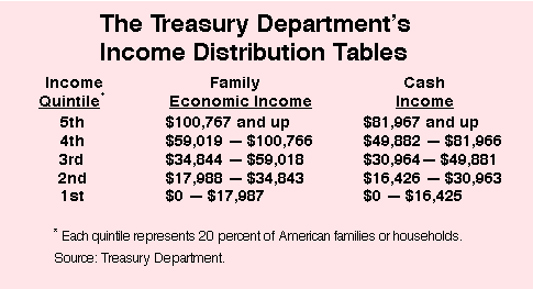
How the Treasury Inflates Incomes
Another reason many people like me didn't get a tax cut is that our income is not nearly as high as the Treasury says it is. The Treasury's definition of income doe not correspond in any way to what you or I or any normal person would call income. Average people probably think of their income in terms of what they actually pay taxes on, which the Internal Revenue Service calls Adjusted Gross Income (AGI). Anyone can find this figure on line 33 of their 1040 tax form. Basically, it is the sum of wages, business income, pensions, taxable interest and dividends and other familiar forms of cash income.
The Treasury, however, takes AGI and adds to it a great deal of "income" that no one would recognize on their 1040, calling it "Family Economic Income." (see the table) This includes estimates of unreported and underreported income; deductible contributions to IRAs, 401(k)s and Keogh accounts; nontaxable transfers such as Social Security and welfare payments; employer-provided fringe benefits; the inside buildup on pensions, IRAs, Keoghs and life insurance; tax-exempt interest; and imputed rent on owner-occupied homes. The last refers to the "rent" that homeowners theoretically pay to themselves as their own landlords.
In short, the Treasury's definition of income bears no relationship to the income we actually pay taxes on. On average, it inflates AGI by about 50 percent. In other words, we are all 50 percent richer than we think we are, based on the Treasury's methodology. The effect of this is to make tax cuts appear to be going much more to the wealthy in the distribution table than they actually are.
Even Cash Income Isn't Really Cash
In response to congressional criticism, the Treasury has lately started producing distribution tables based on what it calls cash income. The figure shows the upper limits for quintiles based on the income definition discussed above and the equivalent cash levels. Still, the Treasury's notion of "cash income" has little relationship to AGI and continues to inflate most people's incomes. That is because it includes tax-exempt interest, employer contributions for Social Security, government transfers and even the corporate income tax.
Income Tax Cuts that Aren't
Furthermore, the Treasury attributes certain tax cuts to incomes that are in fact not paid out of incomes. Thus it includes in its distribution tables the proposed cuts in the estate and gift tax included in the House and Senate bills. But estate and gift taxes are paid out of assets, not annual income. The effect is to make the proposed tax cuts appear tilted much more toward the rich than they actually are. A similar problem exists when capital gains tax cuts are distributed.
Needed: Honest Tables
There are many other problems with the Treasury Department's distribution tables. Similar criticisms could be leveled against Congress's Joint Committee on Taxation and private organizations like CTJ and CBPP, which also adjust the definition of income in their distribution tables in ways average people would find bizarre. The effect of all such adjustments is to inflate income as most people understand it, making them appear to be richer than they actually are. Hence, tax cuts for those who believe they have modest incomes are attributed to the "rich." It is phony and dishonest.
It would be far better for everyone who produces distribution tables on pending tax bills to use a common definition of income that is familiar and intelligible to most taxpayers. That would be AGI, which all taxpayers can easily look up on their most recent tax return. Manipulating income definitions may serve some theoretical economic purpose, but is misleading in the course of political debate. For this reason, leading scholars, such as Professor Michael Graetz of Yale, have actually suggested that distribution tables not even be produced during tax debates. They are too easily distorted and manipulated for political purposes. Better, he says, that such tables only be issued after the fact, showing how tax legislation affected the tax liabilities of real people, not those with incomes that do not in any way correspond to what the IRS really taxes.
This Brief Analysis was prepared by NCPA Senior Fellow Bruce Bartlett.